


Switchin' it up again
Okay, I made changes to the layout again:
1. Obviously, it's pink now. I hoped that would get rid of the "Jenna Fox" feel, because that was NOT what I was going for.
2. I dimmed the crease in the back, because people said that was distracting.
3. I gave the rick-rack a shadow and lightened the butterfly more, hoping that would make the butterfly less distracting. (I'm not sure it worked...)
Also, even if you don't or do like this layout, you may like this one better:
I've changed my poll on the side, now you can vote for green or yellow. But I still really want you guys to comment, because I want to make this right. If you still don't like either, let me know!
What think my judges now?
1. Obviously, it's pink now. I hoped that would get rid of the "Jenna Fox" feel, because that was NOT what I was going for.
2. I dimmed the crease in the back, because people said that was distracting.
3. I gave the rick-rack a shadow and lightened the butterfly more, hoping that would make the butterfly less distracting. (I'm not sure it worked...)
Also, even if you don't or do like this layout, you may like this one better:
Click for full size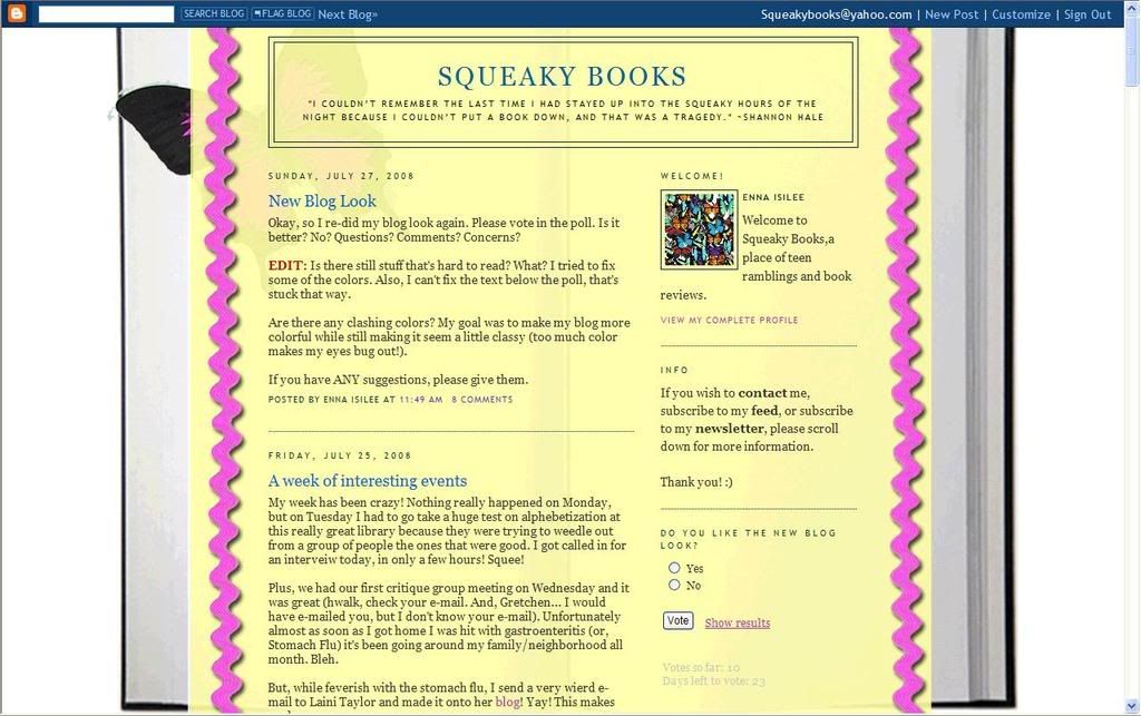
I've changed my poll on the side, now you can vote for green or yellow. But I still really want you guys to comment, because I want to make this right. If you still don't like either, let me know!
What think my judges now?


To me, the pink and yellow shades go nicer together. But I guess that could make it look a little girly, which I know you are a girl ;), but it might detour the male species. So now that I've given my opinion and then shot it down in one stroke . . .
ReplyDeletemaybe try yellow ribbons with the green background.
I really like the pink ribbons. I think it looks so much better now, and is totally cute as well :)
ReplyDeleteAbsolutely awesome layout -- woo hoo!
ReplyDeleteI have to say, as much as I LOOOVE that shade of green, I think for this layout I prefer the yellow...it looks more like the inside of a book and kind of makes the whole layout seem more...I don't know, "whole" instead of disjointed.
Here's a thought; just throwing it out there... what if you changed the background green/yellow color to something closer to the grayish of the book background? Not necessarily the same, but similar; then they would blend together more...although now that I think about it, you did say you wanted more color, didn't you? So never mind :)
:) Thanks.
ReplyDeleteAnd yes, I'm going for more color. I really liked the green layout (and green is my favorite color) but I wanted something a little brighter... that's my only complaint about my layout, is I wish it had even a little MORE color, but I'm not sure how to do that without making it overwhelming.
And I tried making one with a grey background and red accents yesterday. It looked really bad.
I kind of miss the flower one.
ReplyDeleteI really like the yellow and pink.
ReplyDelete