


Not so much cover love. I can fix it!

So this week Bree Despain revealed the cover for the third book in the Dark Divine series. And there it is. You can click if you want to see it bigger.
I like the cover, and I like the IDEA of the pose, but honestly... it kinda creeps me out. What's up with the evil claw-hands? And at first glance I thought there was some boob-age showing. For me, this series has never been a "bare-back/chest" kinda story. If they cut off the hands/torso and just left the legs facing backwards, I think I'd like it a lot more.
EDIT: I decided that this cover needed my photoshop assistance. I am not skilled enough to completely remove the font and change it to be more script-y like the others, or move it lower on the cover, so this is the best I could do. But this is more like what I would want to see:

I do love the color, though! But just for kicks and giggles, and since it seems to be tradition, here's my green-ified version of my adjusted cover:

What do you think about the actual cover? What do you think about my adjustments?
Here are the other two, in case you're curious.
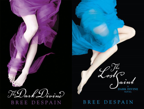

All review content © Enna Isilee, Squeaky Books 2007-2011


they should have stayed with the same pattern. I agree about the hands...major claws!
ReplyDeleteThey should have put the bottom part only in the side like in the other covers. Also, I'm not a big fan of the new font. This cover looks awkward.
ReplyDeleteI like your version more. It looks better with the other covers.
ReplyDeleteI didn't notice the different font until you pointed it out. Why did they change it? The old font was so much better.
Ooh, that cover does look awkward. It's such a weird pose, I don't know what I am looking at. Your are good with the photoshop.
ReplyDeleteI completely agree! At first, the top half of the body looked like it was facing forward, and flat chested while the legs were backwards. And the creepy claw hands are... just that, creepy! I would definitely go with your edited cover, they should have stuck with just the legs.
ReplyDeleteYour photoshop job definitely fits in more with the previous covers. Seeing the actual cover creeped me out too; I also think I would prefer a green dress to red, like they were moving backwards through the rainbow.
ReplyDeleteYeah, totally awkward pose. Wonder why they went so far off the other covers with this third book? Your cover fits the series much better.
ReplyDeleteI approve of your cropping. And it's one of my biggest pet peeves when book covers in series change font from cover to cover.
ReplyDeleteI wouldn't have noticed the hand til you pointed them out, but now they are horrible!!! Love the way you cropped it. Wonder why they changed it up some?
ReplyDeleteI don't mind the new pose, but I do agree that it looks different from the others. I like the coral, but I was hoping for a green cover because purple, blue, and green is my favorite combination of colors.
ReplyDeleteSomeone should listen to you. ; )
ReplyDeleteG.C.
I actually really liked this cover until I read what you didn't like. Then I was like. . . "Oh yeah!" I like your version MUCH better! :)
ReplyDeleteI definitely like the green one!
ReplyDeletePabkins @ Mission to Read
however feet...I don't know feet are such a private thing haha to me thats like being naked
Oh my is that a glimpse of side boob I see? I'm looking at the cover on my Droid so with the small screen it's hard to tell but I can see enough to know I'm not a fan of this cover...but I'm really looking forward to the book! I need to post my TDD and TLS reviews on my blog. I really liked them. I would love to get my hands on an ARC of The Savage Grace....but man, I wish they would rethink this cover.
ReplyDeleteCan't stand the new cover! Why ever would it go away from the legs and dress only look? Hate the bare back, hate the skeleton hands and definitely hate the side boob shot. I loved the first two cover. Thought they were classy, not skanky....
ReplyDelete*covers*
ReplyDeleteI thought the hands actually were claws. It does make it rather creepy.
ReplyDeleteI like your green/neon version so much better. It goes with the other two because all those colors pop up and are bright. I mean, red is bright but there's a lot of red dresses in books right now-- green? not so much. And plus, being that bright, it will definitely catch your eye.
ReplyDeleteI agree! I'm not a fan of this cover, and it definitely benefited from your makeover. :)
ReplyDelete